
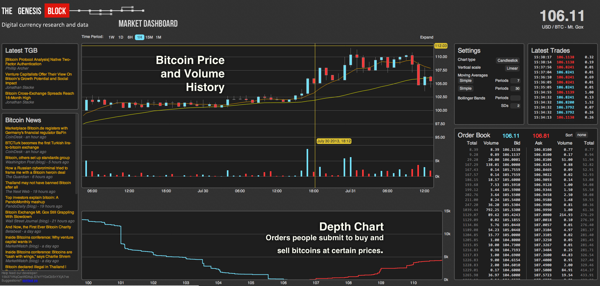
The price of Bitcoin can be a daunting subject to study. Market dashboards like this one from The Genesis Block provide tons of useful information, but they're very confusing to read at first. I'm going to walk you through what everything means!
Overview
- Price / Volume Chart - Displays the bitcoin price and volume history.
- Order Book - A list of Bid (buy) and Ask (sell) orders that people have submitted to, in this case, Mt.Gox.
- Depth Chart - a visual representation of the order book.
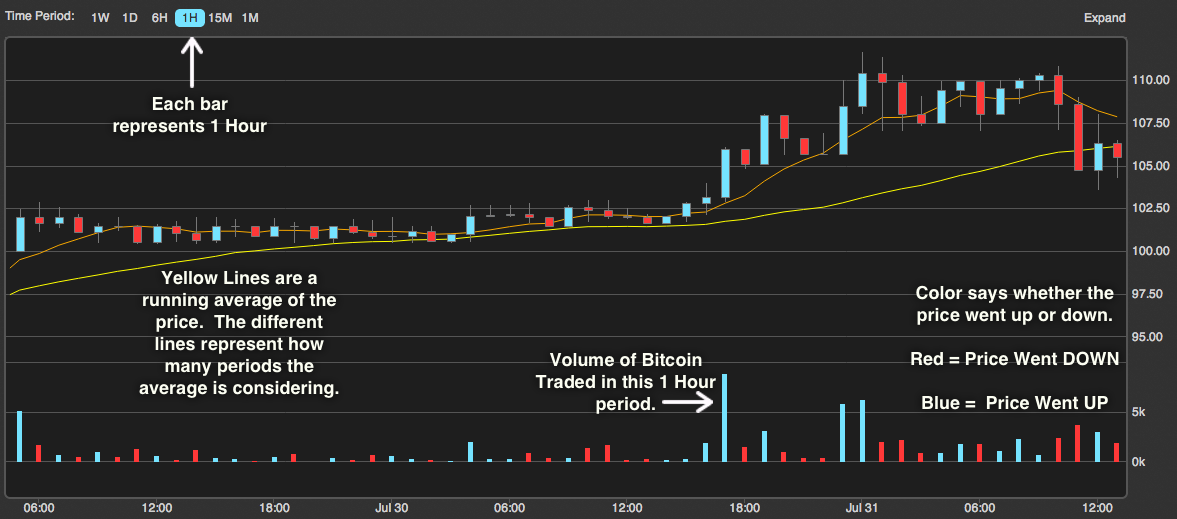
Price/Volume Chart
Lets take a closer look at the Price/Volume chart. This chart shows a timeline that describes how the price and volume have changed over a number of time periods. The period is selected in the top left corner and in this case is set to 1 hour.
There are actually 4 separate data representations on this chart. The volume of bitcoin traded during each 1 hour period is shown across the bottom.The color of those volume bars indicates whether the price went up or down during that period. Red means the price went down and blue means the price went up.
The orange line shows the 7 period simple moving average of bitcoin price and the yellow line shows the 30 period simple moving average of bitcoin price. A simple moving average is the average price that bitcoin has sold for over the X previous periods, where X is the variable you set, in this case 7 and 30 periods. These lines are configurable in the dashboard settings and will be explained further below.
The final data representation is the candlestick chart (the red and blue bars with sticks coming out), which displays the highest, lowest, opening and closing prices during the period. The color indicates whether price went up or down during that period. Again, red means the price went down and blue means the price went up.
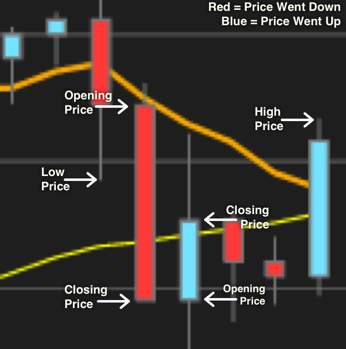
Candlesticks
Lets take a look at the candlesticks in more detail. Each candlestick gives 5 pieces of data and represents the data for a specific period of time, in this case 1 hour. The very top of the stick gives the highest bitcoin trading price for that period. The very bottom shows the lowest bitcoin trading price. The color of the bar says whether the price went up or down. If the bar is red, the top of the bar indicates the opening price and the bottom of the bar indicates the closing price. If the bar is blue the bottom of the bar represents the opening price and the top represents the closing price. The closing price of one period always lines up with the opening price of the next period, for obvious reasons.
Order Book
The order book is just two lists. The Bids are a list of orders people have made to buy a certain volume of bitcoin at a certain price. The Asks are a list of orders people have made to sell a certain volume of bitcoin at a certain price. In this chart the lowest ask price is slightly higher than the highest bid price. When the lowest ask price and the highest bid price overlap a trade on the exchange is executed.
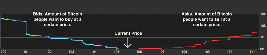
Depth Chart
The depth chart is a visual representation of the order book. The blue line represents the bids and the red line represents the asks.
The height of the bid line at any point represents the total number of people looking to buy at that price or higher. So as a seller, you would be able to list 5,000 BTC at 102 and have the sale execute immediately. This chart is cumulative, so those 5,000 BTC include people who are willing to buy at higher prices, in this case about 2,000 BTC at 104 for example.
The same theory applies to the ask line. The height at any point is the number of bitcoins available for sale at that price or lower.
These two lines meet at the current price of bitcoin.
What does this all mean?
I've given you the tools to extract data from these charts, but how do you use that data to make trading decisions in the Bitcoin world? Unfortunately that's a much more difficult problem. There's a lot of speculation about what different features of depth charts can mean. One forum has a thread over 1200 pages long discussing what "bid walls" mean, like the one at 101 on this chart. You'll have to do a bunch of research yourself, but a good starting point would be this Introduction to Stock Chart Patterns.
Hope that was helpful, and good luck trading!
If you have any more questions, or would like other Bitcoin topics covered, feel free to tweet me at@rossrobinson, or send me an email at [email protected]. If you don’t own any bitcoins yet, check out our new project, Tinkercoin. It helps you get started in the Bitcoin world, buy your first bitcoins and start spending them in under fifteen minutes.